This Unbounce review explores its primary features, the corresponding functionalities, overall pricing plans, plus the type of users the platform is built for.
If you’re reading this, you’ve probably tried out landing pages before. And so have many marketers and most ecommerce businesses.
Now get this- only about 22% of businesses are happy with their consequent conversion rates.
What about the rest? Well, let’s just agree that they are struggling to find a footing in this seemingly complicated engagement.
Admittedly, building an effective landing page sounds simple. But it isn’t. That’s why the average conversion rates range from 1% to 3%.
So, evidently, it takes much more than setting up a page with a couple of flowery words and offers to trigger conversions.
For starters, one, two or three landing pages are significantly insufficient. Businesses with 10 to 15 landing pages are now generating 55% more leads.
The media used also plays a substantial role in the subsequent engagement process. Introducing videos, for example, can boost conversion rates by 86%.
Then comes the strategy that many marketers are seemingly overlooking- testing. And that’s despite the fact that companies whose conversion rates have improved recently leveraged 47% more engagement tactics, and ran 50% more tests.
My point?
Well, going by these dynamically complex requirements, it’s pretty clear that it takes an equally dynamic landing page builder to set up and sustain a good campaign.
And that’s why I decided to check out Unbounce.
Unbounce Review: Overview
Unbounce has been in the landing page business since 2009, and has managed to establish a solid footing in this space over the years.
Today, this service is much more than just a landing page builder. It not only facilitates creating, publishing and testing of multiple landing pages, but also continues to provide a wide range of tools for optimizing engagement and subsequent conversion.
Through the years, it has consistently refined its functionalities to accommodate the ever-changing market needs, and the correspondingly fluid user behaviors. As a result, it has managed to attract more than 10,000 customers, who’ve subsequently used its tools to drive over 250 million successful conversions.
Well, it’s understandable that its fans argue that Unbounce is a revolutionary platform that supports all there is to landing pages. But, I’ve always been a bit skeptical about this.
So, I decided to see it for myself, through a comprehensive evaluation and assessment of all its tools.
And these are the findings.
This Unbounce review explores its primary features, the corresponding functionalities, overall pricing plans, plus the type of users the platform is built for. I’m also going to let you in on its notable drawbacks if you stick around.
So, here we go…
Unbounce Review: Features
Landing Page Builder
The first thing you’ll possibly notice as soon as start building a landing page is that Unbounce is quite different compared to other page builders. While the bulk of other dominant builders focus on simplicity, Unbounce is seemingly attempting to combine everything on one platform.
Well, of course, the drag-and-drop function makes the whole designing process simple and straightforward- even for non-coders. But, let’s face it- the wide range of functionalities makes it a bit sophisticated.
On the bright side, however, at least you can work with it comfortably. And when you finally learn the ropes, you’ll be able to tie everything together and customize the page quite extensively.
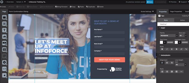
How, you ask?
It turns out that the entire landing page building process is centered on the templates. And Unbounce provides quite a wide array of them, each of which is universally customizable. You can edit various elements to align the entire layout and outlook to your specific brand.
And you don’t have to worry about building a separate landing page for mobile users. All the templates have been optimized for both mobile and PC by default. So you should be able to shift between the two views.
Now, that pretty much covers the outline of your landing page. Figuring this part out is relatively easy. But things start becoming more intense when it comes to the precise page elements.
The text editing process itself is pleasantly dynamic. Thanks to the built-in Google Fonts, you can select a unique and suitable typeface from over 840 different options.
Then to make your landing page stand out, consider blending that with Unbounce’s graphical features.
You can, for instance, tweak the entire page to achieve a full-screen background, complete with attractive images. And to engage visitors further, you could take advantage of the video widgets to embed relevant clips that would be auto-played in the background.
And that’s not all. Unbounce also offers parallax scrolling to further optimize user experience. This is basically what you leverage to set up a smooth 3D-like experience on the entire layout.
Other than that, you can add custom forms to collect relevant information from your visitors. Then capitalize on Unbounce’s API to introduce specialized integrations.
Well, with all these features, you might be tempted to combine numerous elements on one page. I’ve done that before. And I admit that the whole thing is understandable from a marketing point of view. Because leads are best engaged via multiple channels.
But, here’s the kicker- many elements on a single page create clutter, which translates to a poor user experience.
Fortunately, Unbounce has thought this through. You can now use declutter your landing page by grouping the elements and moving them into a lightbox. Consequently, you’re able to maintain critical elements and information while enhancing the overall user experience at the same time.
Conversion Tools
All things considered, the one thing that makes all the difference between typical web pages and landing pages is conversion.
And Unbounce seemingly takes this very seriously- going by the conversion tools it offers.
One of the primary ones is pop-ups, which can be set to appear anywhere on your website. Creating them is as simple as dragging and dropping a couple of elements, throwing in some edits, and voila!
In addition to that, Unbounce comes with sticky bars to further supplement your campaign. While pop-ups are understandably flashy, sticky bars are usually subtle- and are mostly used for engaging mobile users.
Just as popups, they can be created in minutes thanks to Unbounce’s conversion-centered templates, plus its intuitive drag and drop builder. Then the resultant sticky bars are set to display on the top or bottom part of the screen like banners.
Now, of course, both popups and sticky bars are hard to miss. They are bound to get noticed by most of your site’s visitors.
However, when you come to think of it, that’s not the objective here. Getting noticed is one thing- engaging and converting, on the other hand, is a completely different thing altogether.
So, guess what? To boost engagement, Unbounce goes ahead to facilitate specialized targeting. This is essentially what you use to ensure that the right elements are displayed to the right audience at the right time with the right message.
The system allows you set custom rules for triggering popups and sticky bars based on visitor activity, URL, location, referring URL, and cookies. You can also set display frequencies, and schedule the elements in line with your campaign period.
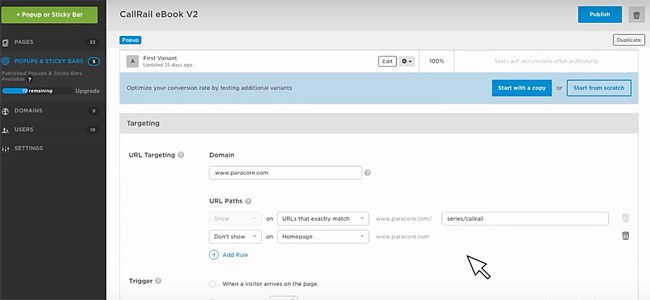
In addition to these two, you also get lightbox forms, customizable confirmation pages, lead generation forms, and dynamic text replacement.
And guess what? They come with accompanying builders and real-time analytics.
A/B Testing with Unbounce
Even with these tools, running conversion campaigns is still a delicate process. It might seem promising on paper, but the practical bit is rather complicated- with numerous variables coming into play.
Like, for example, a campaign that works for your team may turn out to be disastrous when it’s rolled out to the actual leads.
Hence, Unbounce provides A/B testing to help you analyze different campaigns critically- and subsequently make informed decisions on what to proceed with.
The testing process is quite simple. You basically create two different versions of the same landing page, with varying elements. The system then helps you separate the site traffic between the two- directing one half of the audience to one version, and the other to the second version.
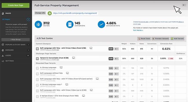
After tracking the leads, Unbounce generates the corresponding numbers applicable to each of the versions. Assessing how your visitors responded to both instances eventually helps you determine the most effectual conversion strategies.
Landing Page Analyzer
A/B testing is only reliable when you’re comparing two different instances of the same landing page. It will give you the winner alright- but you’ll never be completely sure about the best possible landing page campaign variables.
Well, until Unbounce introduced the landing page analyzer late last year.
As the name suggests, this tool crawls through your landing page, picking out potential problems, before it finally generates a comprehensive report.
Among the details in the report is a comparative summary of your landing page compared to others in the same industry. Consequently, you’ll be able to establish best practices that have been proven to be effective with your type of audience.
The report also provides crucial performance insights on page requests, loading times, and overall speed. Plus the corresponding SEO status, and content engagement.
And you know what? You also get special suggestions on how you can resolve the problems, and consequently boost your conversion rates.
Overview of Features
- Full-screen backgrounds
- Widgets
- Videos
- Blank pages
- Mobile responsive templates
- Confirmation pages
- Dynamic text replacement
- Real-time data
- Unlimited a/b testing
- Multiple client management
- Account transferring
- Campaign grouping
- P filters
- Fast page loading
- Third-party integrations
Unbounce Pricing
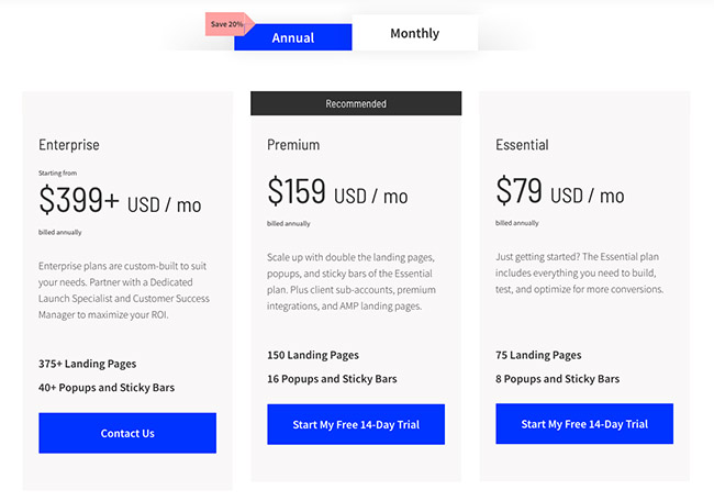
Here’s the good news- you can start off with a free trial. And it’s relatively generous since it runs for thirty days.
But, here’s the bad news- although thirty sounds like a great deal, the free trial only accesses two of Unbounce’s three plans. The most advanced plan, unfortunately, is only open to paid subscriptions.
And paying doesn’t take a few dollars. Compared to other renowned landing page builders, Unbounce is not cheap at all.
Here are the details:
Essential – $99 per month or $79 per month billed yearly
- Infusionsoft integration
- High-converting templates
- Popups and sticky bars
- Drag and drop builder
- Hubspot integration
- WordPress integration
- Zapier integration
- A/b testing
- Google single sign-on (SSO)
- SSL encryption
- Dynamic text replacement
- Unlimited domains
- Unlimited users
- 8 published popups and sticky bars
- 75 published landing pages
Premium – $199 per month or $159 per month billed yearly
- High-converting templates
- Popups and sticky bars
- Drag and drop builder
- Popup and sticky bar scheduling
- Advanced popup and sticky bar targeting
- Salesforce integration
- Marketo integration
- 5 client sub-accounts
- 16 published popups and sticky bars
- 150 published landing pages
- All Essential features
Enterprise – From $499 per month or $399 per month billed yearly
- High-converting templates
- Popups and sticky bars
- Drag and drop builder
- All Premium features
- Template Migration Service
- CTAConf Ticket Included
- Dedicated Launch Specialist
- Customer Success Manager
- Audit Logs
- Two-Factor Authentication (2FA)
- Full Feature Access
- 15+ Client Sub-accounts
- 40+ Published Popups and Sticky Bars
- 375+ Published Landing Pages
Who Should Consider Using Unbounce?
All in all, the main drawback here is the learning curve. Figuring everything out takes time, especially if you’re a novice marketer. Only experienced marketers, I assume, would be able to hit the ground running.
Other than that, I find Unbounce a bit overpriced for a landing page builder. Of course, I understand that it combines page building and marketing capabilities, but $99 per month for the base package is relatively high. Especially considering the fact that its on-site marketing features are limited.
That said, I’ll admit that Unbounce is a fairly solid landing page solution. It delivers what it promises, as long as you know how to work with its tools. But only experienced marketers and marketing agencies have been able to do that.

